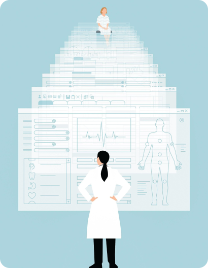
Designing a Mental Healthcare System for Hospitals that replaces
traditional Pen and Paper Patient Records Management

The development of Hospital Information System eventually will lead to demands for a better design, whether it is a better technology design or a better visual design.
These two can help the user to maximize the benefits of the Hospital Information System that can result in improvement of patient service in general and more valued by design can be reached.
Our role as a designer that we are part of the change process that can initiate change in hospital information system that created.
INDIA HAS Seen a dream of Digital India
In 2018, Government of Karnataka and EHRC had decided to overcome the problem of Managing and Recording Mental Health Records to enable continuity of care and support patient mobility from Pen and Paper to Digital.
They Introduced “e-Manas Karnataka”
I’m part of an ambitious project to create Accessible, Aesthetic, Minimal, and Iterative Experience.
To comply with my non-disclosure agreement, I have omitted and obfuscated confidential information in this case study. All information in this case study does not necessarily reflect the views of e-Manas.
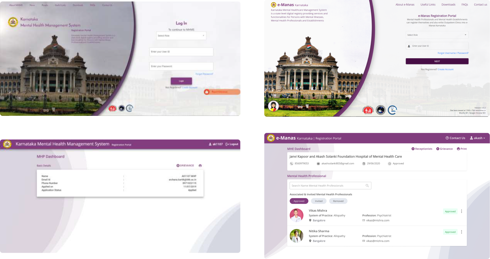
The evolution of the ‘e-Manas’ application from 2018 (left) to 2020 (right).
Overview & Objective
Building Application for Mental Healthcare, Patient-Centric and Ease to Use, how the efficiency and quality care could be measurably improved
- A digital platform that integrates mental health services delivery across Karnataka, supports the needs of patients and caregivers, healthcare professionals, medical establishments, and administrators.
- Patient-Centric registry of health records to enable continuity of care and support patient mobility.
- Registry of mental health professional and establishments
- Ease of use at the point of care
- Facilitate compliance with Mental Healthcare Act 2017 and Rules, as well as emerging data protection requirements.
My Role & Duration
SOLELY UI/UX DESIGNER
I had started working in June 2019, I was responsible for designing the experience for 5 Modules Patients, Establishments / Professional, Medical Records, Authority Portal, and Configuration Module.
In addition, I worked alongside UX writing, Visual Designing and Programming.
The application was launched on June 26, 2020, by Chief Minister of Karnataka Mr. B. S. Yediyurappa.
Who are the users?
- Patients
- Mental Health Establishments/Clinics
- Mental Health Professionals/Receptionist
- Mental Health Authority Admins
- Mental Health Review Board
Partnership

Design Considerations and Challenges
Patient & Doctor satisfaction will be measured by time saved - not spent
- UX and Usage - Encourage use and adoption across user group eg: Professionals, Establishments & Patients
- Standards Compliance - Compliance with health data standards, (evolving) guidelines for the healthcare system.
- Integration with external systems - Part of an emerging health information
- Accessibility - Improving design experience and information architecture. Increasing the health practitioner’s and patient’s accessibility is perceived with the findability of information.
- Security and Privacy - Maintain security data, Enable sharing with patient consent, and consistent with upcoming laws/regulations (e.g. PDP Bill 2019).
- GIGW Design Guidelines - Validating, implementing, and reviewing design according to the GIGW. To help Indian Government websites become compliant with GIGW.
- Scalability - Intended to cover the entire population of the state and all mental health providers and establishments. Also potentially other health conditions.
UX Process
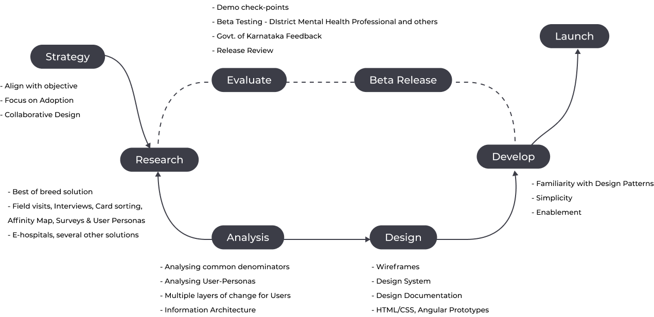
Phase 1 - User Research & Insights from the Field
User Interviews
We organized several interviews with different categories of users i.e. Hospital receptionists, Mental Health Doctors, Admin Authorities, and Patients. We find out, in any app that collects medical data, it’s important to design a simple, easy-to-discover feature for patients to share data with their doctor.
Doctor & Patient appreciated a more casual language at times, but most of them still wanted the overall design and tone to feel medical


User PERsonas
Based on interviews with different categories of users, I established 4 key people involved in the experience.
The objective of the personas are to help us empathize with our patients more and increase the odds of coming up with solutions that will better solve their problems.

User Journey
Looking into a patient's entire journey may reveal the reasons why they fail to follow up on a treatment plan.
Every patient journey is unique to them and patients’ needs may vary based on their unique conditions, including permanent or temporary disability, lifestyle, and personality.
For example, a missed medical appointments, for many patients, is the result of challenges in coordinating the logistics of special transportation needed to accommodate their chronic condition.
Healthcare is emotional. When problems are emotional humans do not always react in rational ways.

Phase 2 - Exploring Current Metrics & interview Validation
Lack of Awareness
Great healthcare software bridges the gap between doctor and patients
- e-Manas has come into existence to enable the MHA 2017. The mental health ecosystem does not know how e-Manas works and how it implies compliance with the law.
- Users might not be aware of the nuances of the law.
- Users will be going through a completely digital system of this sort for the first time.
- People might not be familiar with the technology.
Empathising Ecosystem View
Infrastructure limitations, people using a variety of machines, unstable internet connectivity.
- People are going to use e-manas along with other systems they are already using while maintaining their current work processes.
- There might be factors beyond our current understanding that pose a problem for e-manas adoption.
- Personas we assume will be using e-manas might not actually be doing so.
Current Metrics
Our goal was to get a general idea of how people's health care habits and to see whether our research insights held true for targeted users. Here are some of the results.

How likely they use mobile application with the following functionalities?

Phase 3 - Ideation
Analyzing Research and Outcome

In healthcare UX, the stakes are high. When we overload healthcare professionals or give them the wrong information or the right information in the wrong order, we pose a risk to the person receiving treatment.
Motivation
- People already have their existing established work processes, environments, and best practices. Having a clear story about what would gain from using e-Manas would be key to adopting and engagement.
- People are hard-pressed for a time as it is, they have optimized workflows with their current pen and paper methods. They might feel having a digital system might slow them down.
Solution Approach
- Defining the design principles (Design Patterns & Mental Modal, Simplicity and Design Lite)
- Design Methodology (User flow, Sitemap, Information Architecture, Lo-fi & Hi-fi Prototype)
- Style Guide definition
- Usability (Ease of spotting CTA, User Testing and Accessibility Across Devices)
LITERATURE REVIEW
In our experience, a healthcare product design process must focus on needs, not necessarily what people want.
We looked at analogous spaces to help influence our design thinking process. Here are some of the things we looked at for inspiration.
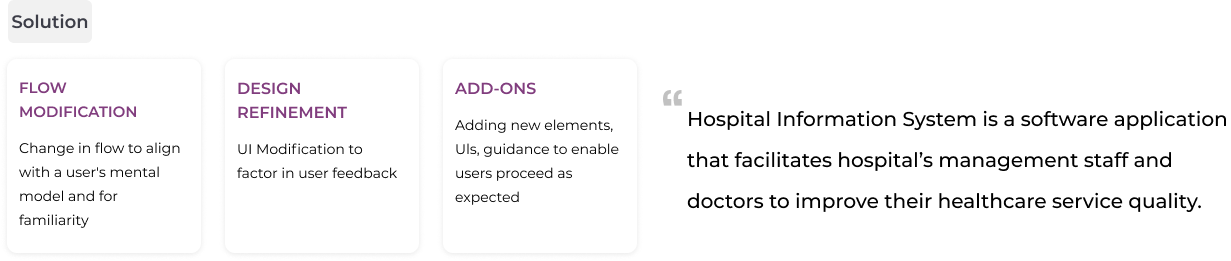
- Hospital Information System is a software application that facilitates hospital management staff and doctors to improve their healthcare service quality. In Indonesia, initially, this application is used mainly as a billing system in the hospital, which the output are the hospital’s operational costs, patient’s treatment cost, and the pharmacy’s purchasing
- The technologies healthcare UX designers help create are not always contributing to a greater good in the medical field.
- A leading cause of medical errors is technology. Our work can, indeed, cause great harm. Or it can aid in creating a higher level of care.
Digitization promises to make medical care easier and more efficient. But are screens coming between doctors and patients?
Overview of Modules and Information Architecture

Phase 4 - Design
DESIGN PRINCIPLES
- Aesthetic Integrity - Aesthetic integrity represents how well an application's appearance and behavior integrates with its function. Demonstrate respect and empathy for their time and attention through thoughtful and elegant craftsmanship.
- Clarity - Eliminate ambiguity. Enable users to see, understand, and act with confidence.
- Efficiency - Streamline and optimize workflows. Intelligently anticipate needs to help users perform tasks better, smarter, and faster.
- Design as the "Mutual Friend" - Helping minimize uncertainties and setting expectations is critical for the user. Remedy lets users know that we care, are there for them, and will do everything to help. Like a good friend, who accompanies you to the hospital, we're there for you when you need us.
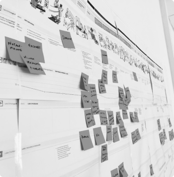
Visual Thinking on Paper & Sketching Interfaces
Instead of wireframing, I opted to sketch my designs on paper. I used paper prototyping techniques to bring designs to life and evaluate them with our users.
This helped me work rapidly and led me to consider more ideas. Sketching many concepts helped me form a broader view of the system earlier ensuring a more cohesive design.


Style guide & icons

Phase 5 - Application Design
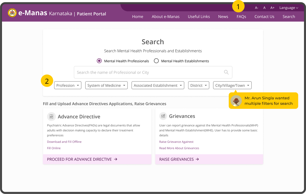
Patient Portal
Building Accessible Interface with Multilingual, Text Scale, and Contrast. Adding advance search filters for specifying results
Adding all features for patients on a single page so the patient can access information efficiently.
- Accessibility Header - Adding Accessibility header in the top right corner with different background, helped patients to access the Accessibility options
- Advance Filter - Adding advance filter helped patients in search results for a specific category of Professionals and Establishments
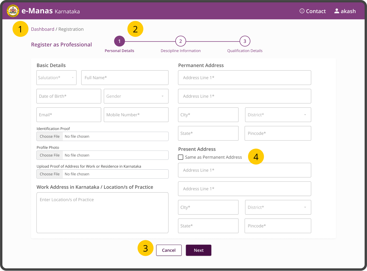
Professional Registration
Creating the Registration Page more Convenient to improve information findability.
Adding Navigation, Information on application progress, and Reducing the time of filling a form.
- Breadcrumbs - It allows users to keep track and maintain awareness of their locations within
- MultiStep Form - This progress bar indicates or informs a user how many steps they have completed and how many steps are remaining.
- Secondary Button - To make a clear distinction between two options, we used different visual weights for buttons.
- Same Address - In many cases, the user has a present address similar to the present address. Adding a checkbox to auto-populate and the same time in filling the form.
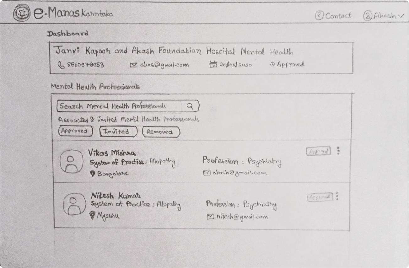
Mental Health Establishment Dashboard
Creating Minimal Establishment Dashboard and Inviting Professionals.
Beyond the aesthetics, looking back and seeing the progress and iteration of a design is rewarding.
- Details Card - It allows establishments to check their details onboard screen
- Search & Tab - Search is a more convenient option to invite new & existing Professionals

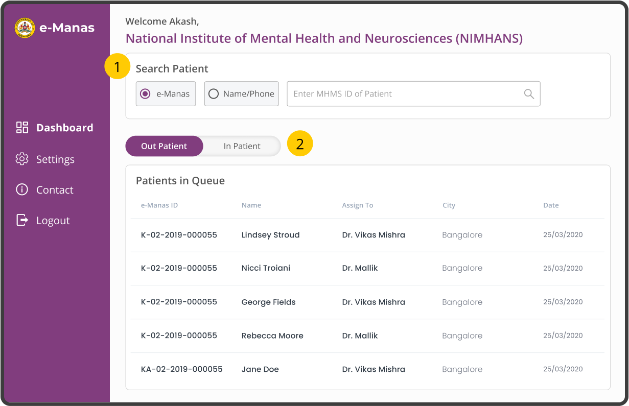
Doctor Dashboard
The ability to quickly digest information and accurately complete tasks in a highly interruptive environment becomes a major priority.
To reduce to doctor efforts we created all the important components in one screen.
- Search - Patient Search can be done with two options which makes it easier to identify the right choice.
- Tabs - Tab made easy Switching between Out-Patient and In-Patient to check available / assigned patients.
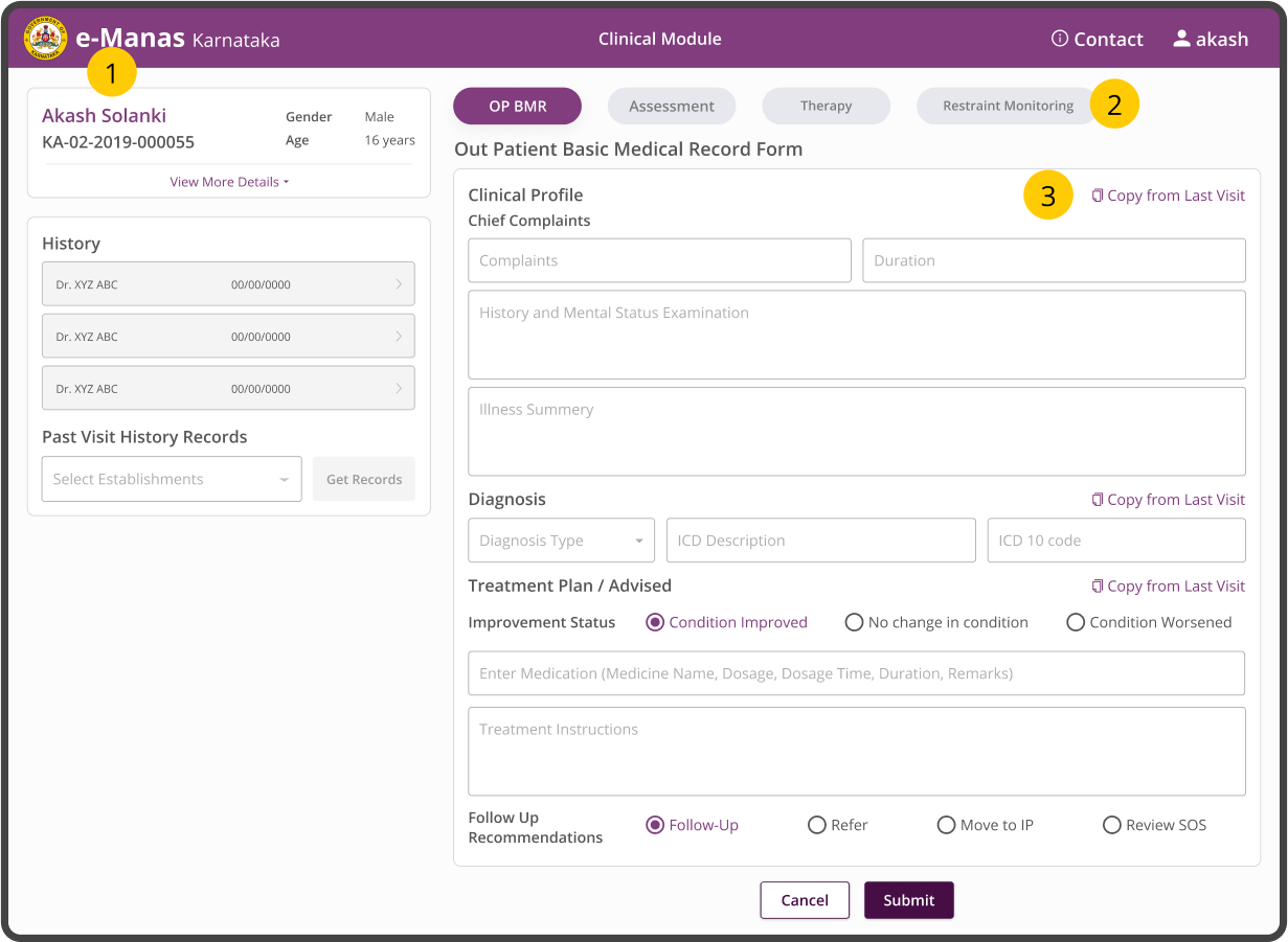
Clinical Forms & History
Users are more likely to overlook minor usability issues in designs with high aesthetic quality.
Doctors can access all the details with a single interface with History and other Forms.
- Collapsible - Important Patient Details are visible and others are hidden to save the space.
- Form Tabs - Switching between form made easy for doctors and findability was increased.
- Copy from History - By adding copy data doctors can save time if the patient has come again for saving treatment and old data can be redirected without looking at History.
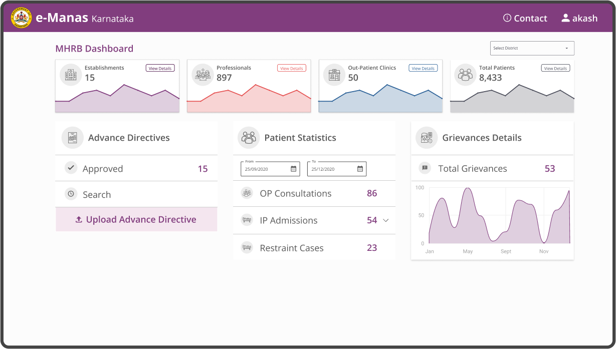
Authority Dashboard
Dashboards must always save the user time so that it helped users to be more efficient.
We used Operational dashboards to show users their current status in the app. Operational dashboards helped to display critical information that’s time relevant.
Key takeaways
- Use more icons instead of labels and headings.
- Keep the unnecessary things hidden (Use drop-downs, Pop-ups, Light Boxes etc).
- Do not try to guide the user too much.
Mobile Application Design

Phase 6 - Task analysis & Usability testing
task analysis with patients
We assigned tasks to 3 different patients to test the patient portal for Search Professionals and Establishments, Fill Advance Directive (AD), and Raise Grievance.

professionals & receptionist
We analyzed the workflow by sitting with 3 Professionals and 1 Receptionist to do tasks from the complete journey of the patient for treatment from coming to moving out of the hospital.

Usability testing
Sketch Prototypes were tested with the stakeholders weekly to get feedback on the functionality, content, and interactivity of the product.
User Testing A few account records were created for Establishment users to use the app on Prodcution Server. All participants were using the app to carry out hypothetical tasks.
MEASURING Design
Once we started measuring and started getting feedback for all major appearances of the application. According to feedbacks, we started optimizing the application, and optimizing our user’s experience is the best investment we made.
FINAL SCORE: 7.5

Outcomes
- Increased the health practitioners' and patients' satisfaction 75% and perceived findability and accessibility of information 85% for ‘e-Manas’ for NIMHANS Hospital and all district's mental health hospitals across Karnataka.
- Improved website design layout for the conversion of websites to responsive, visually appealing, aesthetic, and accessibility in design.
Learnings
- Simplicity is Strength - As a designer, we are often lured by attractive, trendy and out of the box designs. But, We must always remember the ‘why’. The primary goal is to understand the user, their problems and then come up with a design that solves it.
- Research is a must - I couldn’t have designed a product users love without the help of the people who will actually use it. The user survey revealed unexpected information and made it possible to adapt the product to users’ needs.
All of this makes it challenging for me, like a puzzle I have to find all the pieces to and fit them together. It is a constant process of discovery, where I am always learning.
Mentions & Featured in
AVAILABLE FOR FREELANCE PROJECTS